Women's Aid Identity Design
Women’s Aid is one of Ireland’s leading organisations working to end violence against women. Since its inception in 1974, Women’s Aid has been providing direct support to victims of domestic abuse and has been working tirelessly to improve societal and political responses to domestic violence. This involves advocating for policy change on issues related to domestic violence, supporting movements to enhance gender equality in society, providing training, carrying out research and running public campaigns. The provision of support services and this ongoing advocacy are the two key strands of Women’s Aid’s work. In a country where 1 in 4 women who have been in a relationship have been abused by a current or former partner, their work is as urgent and necessary as ever.
In 2020, Language was commissioned to update Women’s Aid’s logo. The new identity would have to express the spirit and purpose of the organisation to two distinct audiences; women experiencing abuse, and ‘advocacy’ audiences comprising policy makers, journalists, other professionals and funders. It would be vital that the new identity expressed the compassion central to their work with service users, while also highlighting the important work they do on addressing structural issues and gender inequality.
The previous Women’s Aid identity expressed strength and protection, but it was felt that the illustrative style would need to be more contemporary, and something that would work effectively in the digital media. Language were tasked with creating the new logo and resolving these challenges in a new identity, one which would thread a line through the last 40 years of Women’s Aid, while capturing where the organisation was now and where it was going.
Women’s Aid are trusted to support and represent the interests of women. They are a constant, always on and reliable service. They are a visionary leader in gender equality and women’s issues.
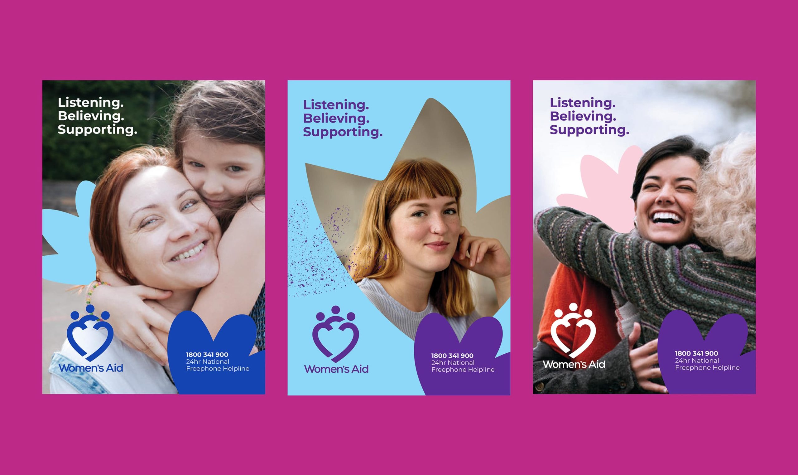
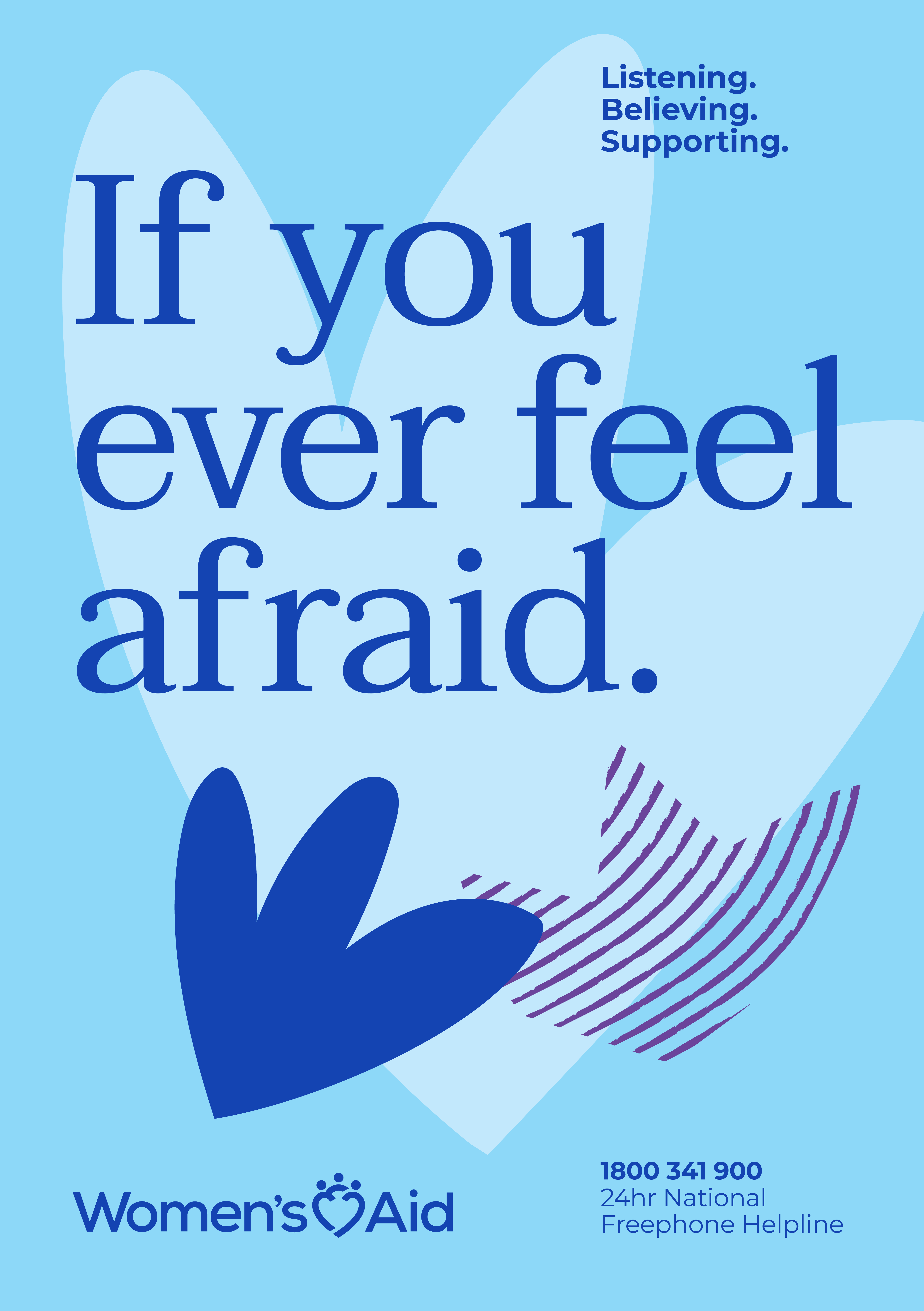
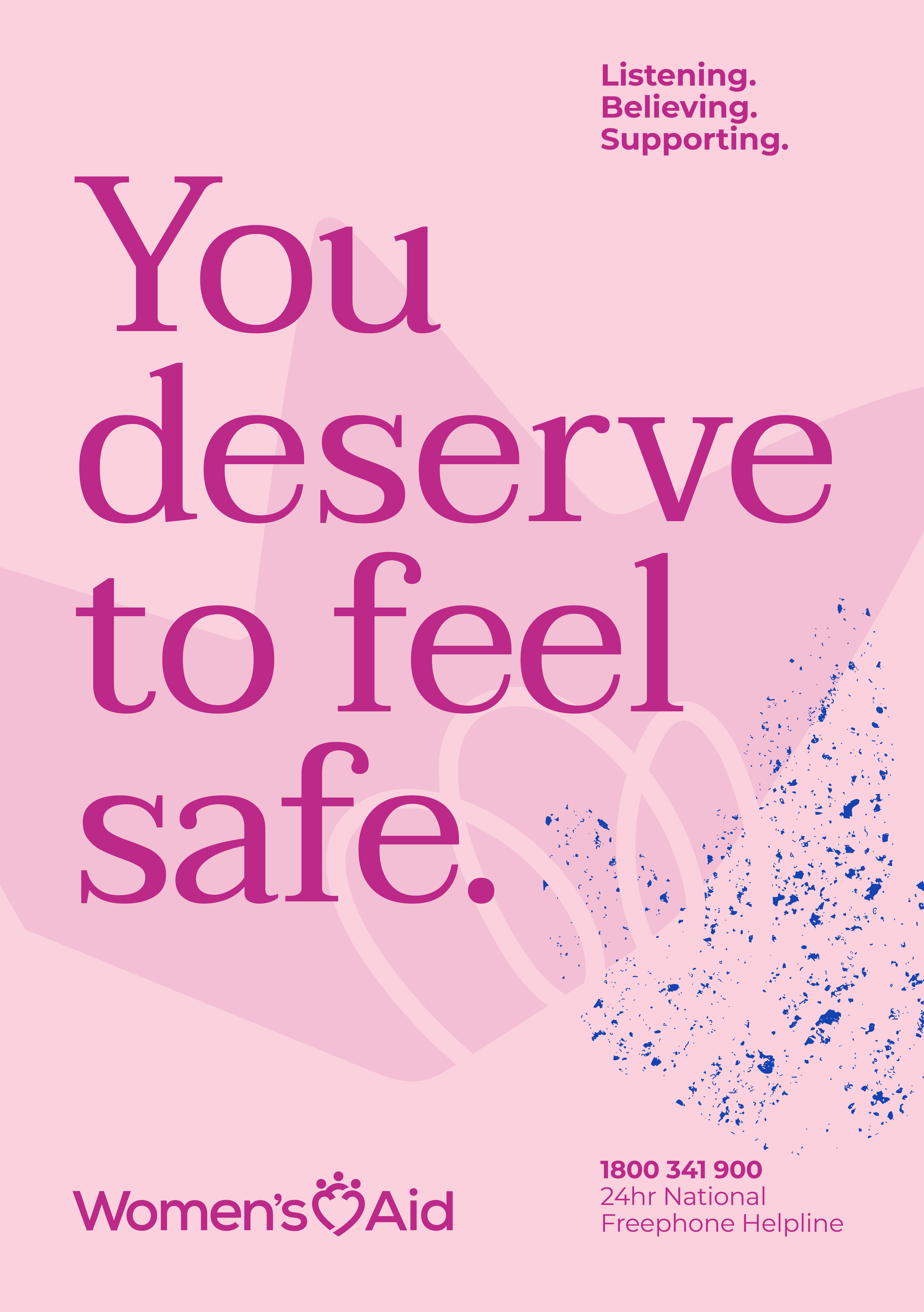
Language produced visuals that explored a number of routes for the identity. This led the collaborative process to a design which evolved the old identity in a striking, contemporary way. We created a mark which incorporated three figures into the shape of a heart, to represent the support Women’s Aid provides, but also the strength and solidarity that is integral to their organisation. The new mark sits in between the two words of ‘Women’s Aid’, emphasising this sense of protection. The sans serif font, the clean lines and graphic simplicity of the new logo more accurately reflects where the brand stands in 2020 and beyond. The iconic Women’s Aid purple was retained, recognising the heritage of the brand.
The new identity has been applied to all Women’s Aid assets, including website, publications, presentations and social media materials. Having long worked with Women’s Aid and produced content for them, we could see how the brand was evolving in real time. Now the overall look of the brand would be aligned with one clear style. Developing the new identity for Women’s Aid was a wonderful opportunity for us to refresh and recalibrate a brand we have worked on for many years, helping to accurately reflect how the organisation has evolved and giving it the framework it needs to continue to grow, change and speak its message into the future.